Microsoft Azure CCC DDoS
Data Visualization
3 Weeks
Spring
Project Manager - Maghana Sathe
User Researcher - Bass Harris
Team
Designer - C.L. Jin
About Azure CCC
In 2017, Microsoft launched the Azure Cloud Collaboration Center (CCC), a centralized workspace for engineering teams to address operational issues and unexpected events impacting our customers. A key focus of this facility is monitoring cyberattack activities. In this project, I was tasked with designing a creative and effective way to communicate data clearly to our users.
My role
I led the design for , I was tasked with uncovering user needs, analyzing data from the cybersecurity team, and leading the design review process to ensure the delivery of an effective and user-centered solution.
Our goal
Provide a creative solution that offers clarity, readability, and seamlessly fits the overall aesthetic at the Azure Cloud Collaboration Center (CCC).
Who’s the user?
The primary users of this project are Azure’s internal cybersecurity teams.
Problem
Currently, Azure Collaboration Center (CCC) lacks an efficient way to communicate the landscape to cybersecurity teams, resulting in slow response times to an event.
Solution
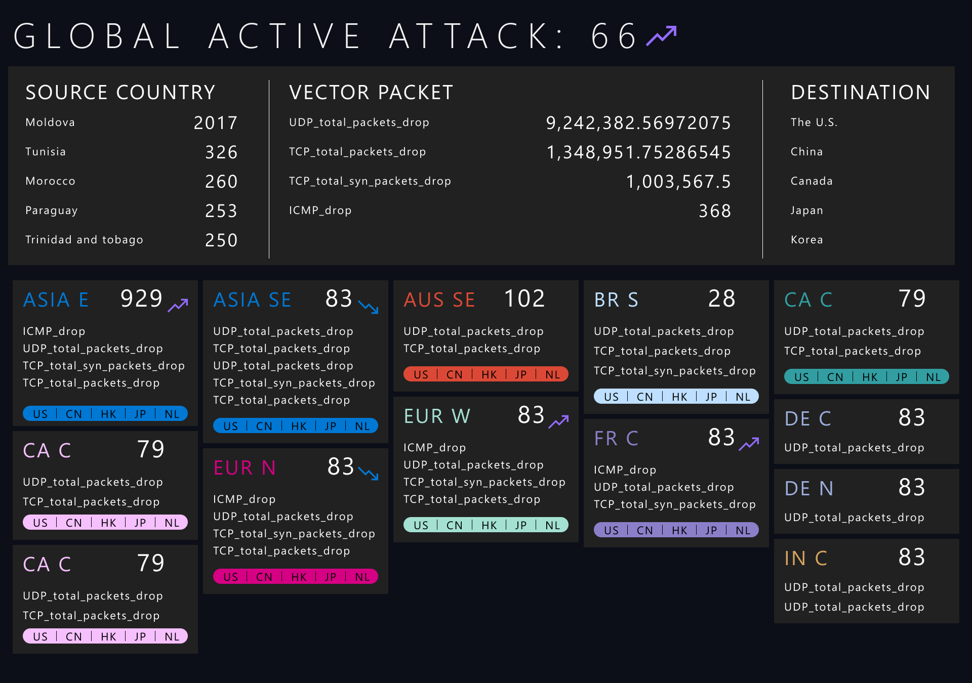
In the final solution, I incorporated a dynamic heat map to highlight regions experiencing the highest cyberattacks. The remaining space was dedicated to presenting data types and values, mitigation counts, and trends on both global and regional levels.
During our user testing, the design received positive feedback for its well-structured information layout and user-friendly interface. Users appreciated its clear display of cyberattack trends, rankings, and different attack types.
Where is it going to be?
Unlike my previous projects designed for mobile and desktop, this project will be displayed on a wall screen. The display section will span 2x2 monitors (originally planned for 2.5x2 monitors).
How did I get there?
Step 1: Understand the data
My first step was to request 24-hours data samples from our cybersecurity team. This has become a key step for me to understand the data's structure and identify patterns that could be helpful for the design.
What I learned?
There are multiple types of cyberattacks, such as Vector Udp, Vector Udp_bandwidth, etc.
Each type of attack has different values, ranging from 17 to 9.3 million.
The regional data follows a similar pattern and is categorized into sub-continents, such as Asia_E, Asia_SE, JP_E, and so on.
What does our user need?
We talked to our user and discovered the core use cases:
User Stories #1
As an Azure customer, I want to understand the DDoS attack landscape and self-identify attack trends globally targeted towards Azure and how DDoS team is protecting Microsoft infrastructure.
Success indicators: the visualization of DDoS attacks being mitigated by the DDoS PG team across all DCs (global), showing attack analytics over last 2 hours including:
count of active attacks
attack vectors
attack source countries
attack destinations (Regions)
User Stories #2
As an Azure customer, I want to understand the DDoS attack landscape, and self-identify attack trends at Azure regions world-wide.
Success indicators: the visualization of DDoS attacks observed at DC/Regions worldwide that the DDoS PG team is mitigating
count of attacks (In coming) where the Region is the destination
attack vectors for the DC/Region
attack sources for the Region
Step 2: design V1.0
Based on the user study, the information architecture can be divided into two categories:
Global cyberattack data
Regional cyberattack data
With this structure in mind, the next step is to understand the nature of the data within these categories.
V1.x - Solution A
A card style was my first go-to option because it fits the overall aesthetic at CCC. More importantly, it's also a great way to group different information when working with complex data.
V1.x - Solution B
The design of Solution A reveals the biggest challenge - it takes up a lot of real estate. So I started brainstorming a listed view table chart to see if it solves the problem I’ve encountered.
And yes, it does, but the drawback is it might be hard for our users to read.
I also explored different table chart styles, but they either couldn't satisfy the user's needs or adding complexity made it hard to read.
V1.x - Solution A vs Solution B
We brought our user group for an in-field testing with the different solutions.
Solution A
Pros:
The user likes the clear structure for both global and regional data.
Helpful to see the top 5 source countries listed in the regional data.
Effective use of trend icons to convey information.
Cons:
The card style takes up a lot of real estate on the screen.
Overuse of color causes poor readability.
Solution B
Pros:
The user likes the clear structure for both global and regional data.
Listed view can accommodate a lot more data and be set with double columns.
The use of trending icon gives the user a quick overview.
Cons:
Listed view results in poor readability.
The testing also revealed higher misreading issues.
The regional data lacks clarity.
The winner
Even though, the solution B can be fit in with more regional data, but our user prefers Plan A due to its simplicity and clarity.
New discovery
During our testing, we also discovered another need:
Our users hope to quickly understand the regional source countries besides the data card table.
V2.x - Iteration
I incorporated the testing results to build the V2.x design. I moved the regional data group to the left side to add a dynamic heat map and best leverage the space.
The upgrades
The data card style has become the foundation of future development since the users prefer Plan A over Plan B.
In V2.x, I made a few upgrades on the regional data card and experimented with the dynamic heat map.
Expanded view
Each regional data card will have two statuses: expanded view and collapsed view. Each card will rotate and display the full data view for 15 seconds.
Collapsed view
Show less information to help the user gain a quick view of the status.
Footer
Provide additional information to help the user understand the meaning of each color
Dynamic global heat map
A global heat map plays a complementary role based on the new discovery from V1.x. It shows regions and source countries in a more intuitive way.
User feedback
Our users love the clarity of the heat map and how effectively it communicates the information to them.
While it's great to use color to represent the vector type, they hope the new design can reduce their learning curve.
The customer does not need to see the detailed value and only needs to show the top 3 vector types.
Our users feel it's unnecessary to display the vector value.
My intention to design the expanded and collapsed view was to try to balance between limited space and a large amount of data. However, our users feel it is difficult to understand the vector color when it's in collapsed view, and they thought it is associated with the source country below, which causes misunderstanding.
New discovery
During the testing, we also discovered a new need. Our user hope to see a global mitigation value.
V3.x - Iteration
Our V2.x testing results showed that the data card design has poor readability, and to satisfy the new discovery, which causes less space for the data, we need to make another trade-off by cutting down the regional data card from top 5 to top 3. Additionally, I moved the regional data table below the dynamic heat map to provide a better reading experience.
Data card
I removed the vector value since it has been shown to be unnecessary for the user. Additionally, we need to cut the regional data card down to the top 3 since I couldn't use the expanded and collapsed mode to save space.
Global mitigation value
I also added the total global mitigation value based on the user’s need.
V3.4 design
I did a little experiment in the V3.4 final design. I applied golden ration to the layout to seek for a better visual aesthetic.
V4.1 final design
Before I handed off the design to our engineering team, I need to make some final adjustment due to the change on the screen size, as well as other detail adjustments:
Monitor size changed from 2.5x2 monitor to 2x2 monitor. It leads to the removal of source countries data group
I removed color variant to reduce implementation complexity.
Simplified the color on the destination card in dynamic heat map to lower the visual hierarchy.
What I learned and what I would have done differently?
This was my first data visualization project during my career, and it was definitely one of most fun projects I’ve done so far.
My initial step in this project was analyzing or understanding the data. It gave me the key to start the journey, but I’ve also had some learning curve. If I would done this project differently:
I would spend more time on the content or low fidelity, rather than jump into the visual design too quickly. It could help me focus more on how to build a organized structure and have a better control on the amount of color variations.
use less color variations can bring better clarity and make the information communication effectively.


